Sometimes you want a newspaper’s mobile app to give you interactive features that you won’t find in a print copy of the magazine. Other times however, you just want to read the news.
DISCLOSURE: I received a trial copy of PressReader from NewspaperDirect to write this review. However, this review has been written to be objective to the best of my abilities to highlight both the good and bad of PressReader.
Instead of bombarding you with hordes of interactive content, PressReader 3.1.3 from NewspaperDirect gives you the meat of the content. It provides the same print copy of the newspaper on your device. By same, I mean the same.
 This may seem like a bad thing at first, since plenty of Newsstand apps just slap a PDF of the print magazine into their apps, leaving you to navigate the jumble on a small display.



The newspaper version’s text is scalable, meaning that you can zoom in and view the text clearly no matter the zoom level. There are limitations to the zoom though. Images will retain their static DPI and will get blurry. This image degradation is unavoidable with the current image formatting standards. When you use the standard double-tap gesture to zoom into the print replica, the PressReader does not seem capable to adjusting the zoom to the article column’s width.
PressReader’s zoom level is on the left. To the right is a more optimal zoom.


You can scroll through all the pages of print by page number. 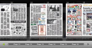
PressReader offers audio playings of the newspaper’s contents for no extra charge. You can listen to the frontpage of the newspaper or you can skip to a specific article. I was unable to try out this feature due to lack of reliable internet where I currently reside so I cannot say much about it.
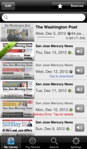 PressReader’s interface is half-baked. The “Library” Tab, where you manage issues is just a list. While you can add sources easily enough by tapping the Sources button. There seems to be no way to sort the list except by the default chronological order. I would assume the star button at the top is a place to favorite issues but I coudn’t find a way to favorite an issue in the first place.
You can only delete single issues with a rudimentary swipe to reveal a delete button or by clicking the Edit button to do a similar motion. There seems to be no “hide” function for individual issues. As seen the screenshot, some of the UI element overlap and there is quite a bit of information displayed for every single issue. An icon based indicator next to each article would be better for display on such a small device such as the iPhone.
The Top Stories and Search tabs appear to be webpages. It would be better for the tab interface to be made of cocoa elements and then populated by parsing server data. In my case, with unstable internet, the webpages took quite a long time to load. The Search tab has a PressDisplay title, it also asked me to download PressReader, which is a bit redundant considering the circumstances. 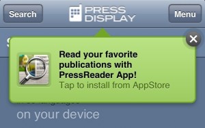
Cost:
99¢ per issue or $29.95 per month for unlimited issues
PressReader’s interface needs some tuning and polish. Nevertheless, it is fully usable and offers a print experience on your electronic device that is hard to find elsewhere. The backend of the PressReader service is well built, I got a notification whenever there was a new article available and the articles downloaded quickly despite shaky internet in my residence. Considering that recent surveys have shown that mobile users actually prefer print copies of content to special “mobile” content, PressReader is on the right track and the “print” format of news isn’t going out of style anytime soon.
